14 Feb
Many of you will remember some discussions about what is a cloud and what not from our diverse set of measurements taken in 2016 during NARVAL-II. We ended up with an illustrative plot (which ended up in the latest NARVAL overview publication), reminding us to always remember how
different the world looks at various resolutions or regions in the electromagnetic space. It's not only a headache, but can also be used for fun and profit, see Sabrina's post from two days ago for example.
At some time in between, I had the happy illusion that the problem of "what is a cloud" (or should I say "what is a hole"?) has actually been resolved already as I found out the National Weather Service from the other side of the ocean actually defines a cloud as a "... *visible* aggregate of minute water droplets and/or ice particles ...". So if I can't see it with my eyes, then there is no cloud, and vice-versa. Sadly, the illusion did not last so long, as cross-checking with the WMO told me that it is indeed enough to *observe* a cloud. So in the end, every sensor is officially fine again and we can happily continue in wondering what actually is a cloud.
As we've seen in the beginning of this year's PreEUREC4A endeavour we've taken a couple of images from HALO through a downward-facing window during NARVAL-II. While we are primarily interested into clouds, we accidentally observed more than we should: the infamous Sargassum, which seems to be present at this very time on the otherwise magnificent Caribbean beaches and might help us in the coming year and also a lot of sunglint, which usually blinds our camera quite a bit. But before I get back to the holes, there is also a bit on clouds.
On Day 14, Bernhard introduced us to the "Glory Days", showing an interesting feature which will help us to pin down the effective droplet radius of the beautiful but hard-to-touch clouds of the Atlantic Ocean. Apart from these measurements, also other passive optical methods are troubled in finding the location of the measured data. While we know that a cloud is directly in front of us, it is really difficult and sometimes surprising to estimate the distance from a single image. Some layered cloud scenes only become understandable when they move. This is the idea behind what is shown in Figure 1: the partly transparent tracks illustrate how a portion of the cloud has moved along a series of images. By triangulation, it is possible to calculate the distance to the cloud and thereby its height above ground. The yellow dots on the right side are (somewhat surprisingly to my eye) higher than the blueish-greenish dots on the left side. When actually watching how the clouds move, it becomes apparent that this is actually true.
Interestingly, the tracks do not pass vertically through the image (the camera is aligned to the aircraft), but tilted at an angle, which is caused by crosswinds, pushing the aircraft. Also, when doing the triangulation for many points and along multiple images, the retrieved cloud location does not stay stable but moves through 3D space. This movement can be projected back into the camera's image (black arrows) and we observe that albeit there are a couple of outliers, this looks a lot like the crosswind we are experiencing at the aircraft.
Now that we reached wind, we can also go back to the clear-sky fraction. Based on the discussions on Sargassum, I tried to look a bit deeper into what we could learn from the sunglint. Sunglint describes the sunlight reflected at the ocean's surface. The sunglint will be spikier (specular) for a flat ocean while it will be smoothed out by the waves. And waves are bigger when the wind is stronger, so there should be some connection, which also has been described by Cox an Munk in 1954.
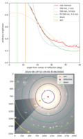
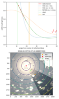
In Figures 2 and 3, you can see some quick results of matching the measured radiance with a simulation of the sunglint. In the lower panel, an image from our camera is shown. The points indicate the direction of direct solar backscatter, the calculated direction of perfect specular
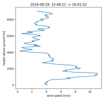
reflection at the ocean's surface and in between, the downwards direction. The concentric lines indicate the distance from the direction of specular reflection in degrees. The panel above shows in red the measured image brightness averaged over the non-shaded region of the image. The curve has a couple of interruptions, because anything which might be compromised by overexposure has been filtered. The dotted lines show exemplary calculations of which brightness we would expect for the given surface wind speeds and the dotted line shows the result of a fit. Note that the images have not seen any radiometric calibration, so effects like vignetting are still present in these figures. Figure 4 shows one dropsonde profile taken in the same area of observation, indicating that the surface wind speed might be in the order of 4 m/s in that area and the fit is not very far away from that number...
I very much like how all these different ideas from everyone during the PreEUREC4A campaign come all together and a lot of new ideas emerge. So see you soon and enjoy the upcoming days of PreEUREC4A and EUREC4A!
Tobi


